David Hockney at the Metropolitan Museum

David Hockney detail.JPG

Despite the fact that this show will close in about seven days, The David Hockney retrospective at the Metropolitan Museum was packed to the gills.

Usually, the best time to see an art show is long after opening night, where you can stand in a gallery and look at a painting for several seconds without interruption or without being aware of people. It's nice to get lost in art.

Very few things are more annoying than someone walking in front of you while viewing a painting, and rest assured - I annoyed as many people as annoyed me at this David Hockney show. I was only able to get the photos for this article because I am fairly tall and I can hold my iPhone high above everyone else. 

Solitude is just not going to happen at a David Hockney show. He's too wildly famous. He's too good. And more, he has something for everyone. 

david hockney the hypnotist.JPG
Hashtag Showerthoughts... 

Hashtag Showerthoughts... 

Hockney's earliest paintings shown in the show aren't even depicted here - the first gallery after entering the exhibit happened to collect the worst Hockneys I have ever seen, pieces that the artist had done as a young art student that were quite bad.

I wish I had taken a couple photos of the 'Bad Hockneys' to prove that there is Life after Art School, but, everyone already knows that, I hope. If anything, the muddy gray Bad Hockneys existed solely to help attendees appreciate the later Hockney even more.

David Hockney Metropolitan.JPG

Hockney made a couple of these shower paintings, a resplendently gay take on bather motifs from Degas. 

David Hockney early painting.JPG
David Hockney Cat painting.JPG

With Hockney it's easy to forget he is using acrylic paint, and as he was painting the above Mr. and Mrs. Clark and Percy in the early 70s, he would have been one of the earliest painters working successfully with the medium.

Though just as bright and as pigmented as oil, fast-drying acrylic doesn't blend or save itself for later. Acrylic favors fast thinkers, fast action, and commitment. If you make a mistake in acrylic, you have to paint over the mistake with no blendability into the bottom failed layer -  and mistakes can stack up quickly.

David Hockney Cat Painting detail.JPG

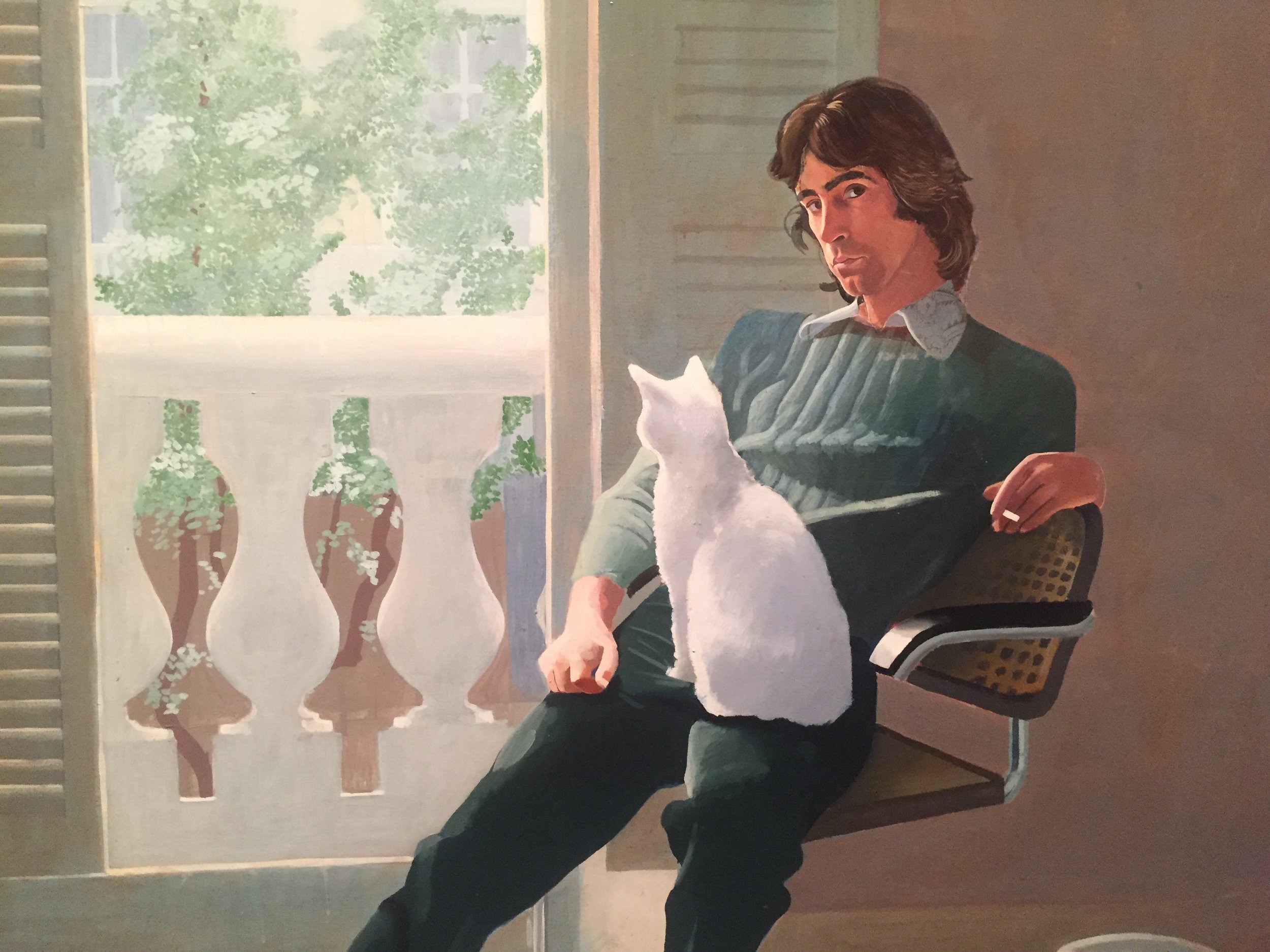
In these realistic paintings, Hockney is a master of drybrushing and scumbling acrylic in order to create atmospheric light. The wall behind Mr. Clark isn't a plain brown, but a sienna with slate blue and green brushed over in smoky clusters. 

David Hockeny Lamp and Phone.JPG

As you get closer to these large paintings, the imperfections show up a bit more - the checkered backing of the chair isn't made up of perfect Lichtensteinian dots. The base of the lamp above is a bit wonky, but the phone is entirely convincing. This is Hockney's magic - not everything is perfect, but we know enough, and we are impressed enough by the color,  to let it slide. 

David Hockney pool.JPG

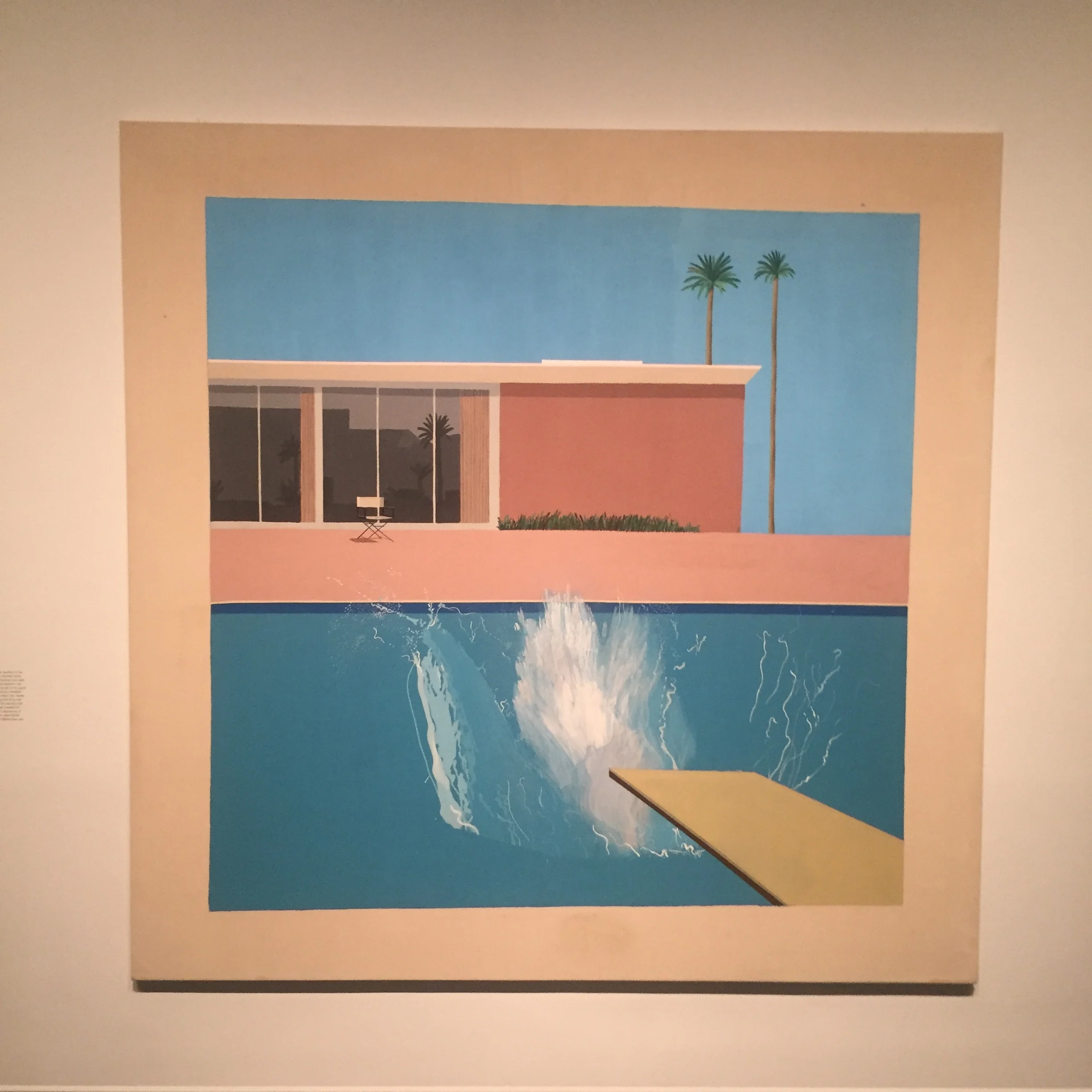
This Hockney Pool painting, or as I refer to it in my mind: "The most SoCal Thing That Has Ever Existed" allows similar up-close imperfections to emerge. I always thought of the painting as a realistic piece, but for some reason, in person, it is more like looking at a painting of a unicorn.

The unicorn feeling is less present in the pool painting below, given the absence of any fancy people.

David Hockney splash pool.JPG

The show also collected some of Hockney's drawings. Hockney is great at capturing faces, hands, feelings, and fashion. In the three drawings below, each sitter has incredibly expressive hands.

David Hockney Drawing - Portrait.JPG

In the book "That's Thee Way I See It" Hockney discusses a series of painted portraits he made of his friends, eventually revealing that none of his friends really liked the paintings he had made of them. These drawings I feel must be different than the paintings, I feel that these subjects must have really liked the drawings. Either that, or they must have been difficult to impress!

David Hockney drawing flowers portrait.JPG
David Hockney Drawing.JPG
David Hockney fuji.JPG
David Hockney Grand Canyon Painting.JPG

The show included a couple of Hockney's paintings of the Grand Canyon - both perfect in the way that the canyon takes up the entire canvas, and the sky is just a small stripe of blue, if anything. I had to love Hockney's use of pale purple and blue on the red canyon walls. 

David Hockney Grand Canyon.JPG
David Hockney Metropolitan Museum of New York Landscape.JPG

In Hockney's more abstract landscapes, it's hard to know exactly what is going on. The primary and high-key colors attack the eyes.

David Hockney country flowers.JPG

Abstractions considered, we all know that Hockney can reel it in with landscape paintings like the one above. Overall that is what I like most about Hockney's work - it's studied, it knows where it is going, yet it is also so free.

David Hockney California.JPG

December 2017 Studio Update

Fairy Slipper Orchids Painting - Leadville.JPG

Before moving to Maryland I made a couple final paintings in Houston, including this piece of a Fairy Slipper Orchid: 

Fairy Slipper Orchids.JPG

I will miss painting in Houston and I will miss the weird ideas that swooped down upon me while stuck in traffic. 

Becky Jewell Flower Paintings.png

These pieces will be available at http://www.harper-rose.com/ in Leadville, Colorado. 

Moving Troll.png

Right before moving I had the chance to visit Paris, France, and see some of the greatest paintings of art history. I was interested to capture the self-portraits of painters and paintings of painters.

"What do you mean, the painting has to be done by tomorrow?"

"What do you mean, the painting has to be done by tomorrow?"


There were moments in the Louvre that surprised me, such as my own awe at sculpture. 

cupid and psyche.png
Cupid and Psyche drawing.png

After the Louvre I tried a quick drawing of the sculpture with the photo as reference. The statue had too many admirers in the museum itself - I would have never been able to get close enough and have enough time to make a drawing there! 

While in Paris I was also able to pick up some water color pencils (more on those soon!) and very special paper.

Geddy the Poodle watercolor pencil.png
Moulin de larroque paper.png

This paper turned out to be so special that when I searched for it online, the website seemed to be defunct. 

The art store in Paris that I visited was this one: http://www.magasinsennelier.net/ I was amazed by their selection of handmade papers, along with many other fine art materials such as pigment, pastel crayons, and easels.  

That is December on the studio side! Catch you guys soon. 

October - November 2017 Studio Update: A bit of everything

This month I began working in a new format - miniature paintings!

A miniature of Mt. Elbert in Leadville, Colorado

A miniature of Mt. Elbert in Leadville, Colorado

Another miniature of Mt. Elbert - about 3 x 3 inches

Another miniature of Mt. Elbert - about 3 x 3 inches

Myst!

Myst!


These mini paintings take about as much concentration or more as a larger painting, say an 8 x 10. Decisions just have to be better and more precise. 

I'm still working through painting my memories, many of which involve video games from the 1990s - up next is a painting of an Arcology from Sim City 2000. Here is the underpainting and the original Arcology: 


On the other side of the studio I have been finally working on something that has been in my to-do pile for months - lettering my comic, Tilted Sun. 

I'm accomplishing the lettering project in Clip Studio Paint (Formerly known as Manga Studio). Although learning Clip Studio Paint took a few painful failures for me and several Googlings of how to get text to work the way I wanted, it's been worth it. (I might try illustrator for this too, soon?) 

All in all lettering has made the comic more real. I've set up about 60 pages of the comic so far without any words, just scribbles of notes of the words that I wanted to use. Ironically this has worked to make the images more expressive - the images were working almost like a silent film until now. 

The font I am using for the comic, Sequentialist, which is a pretty rad font! 

The font I am using for the comic, Sequentialist, which is a pretty rad font! 

The first part of the comic also took different turns than I expected - I had most of it written out but then decided to discard a lot of the first, second, x drafts, in favor of what felt better, or indulging "what the comic really wanted to say". 

Tilted Sun_ Bird_Becky Jewell.png

It continues to take me a long time to work on this comic because writing and doing art for and lettering a full color comic takes many hours of thought at different levels. Oil painting feels like a break compared to it. It works for me to spend time on both, especially since paintings emerge into the world as physical objects, and the comic just lives in screens (for now).  So, painting is the day-by-day mini reward that helps me keep going through the comic. 

Tilted Sun Comic - By Becky Jewell.png


All in all October was a solid month and November is off to a great start! Thanks for stopping by on the blog, and catch you soon! 

Becky Jewell.png