
1. Blue line bones
In sketching portraits I usually start out with a blue line because blue is easy to see, and it also creates a nice residual effect in a finished painting. In life there is no such thing as line, definitely not black line. Using blue line means you can sketch in the bones/foundation of a portrait, and later on allow the portrait elements to take on a more skinlike quality than it would with black line. I'd argue blue is better than sienna, another popular lining color, because people of all skin types have some sort of blue shadows or highlights in their skin.
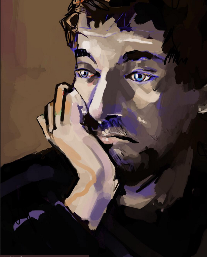
The best part about digital portraits is that colors never get muddy. Overmixing disparate colors in oil painting creates a lightless grey, but, this problem does not exist in digital painting. So, I tend to use carnelians and blues as much as possible.
2. Finding stuff to draw
To find models or source images, I just look for images on Google and bring the app in alongside Procreate. It is likely much better to work from life. I have seen other figurative artists do an incredible job sketching live models.

My goal is to make any portraits from stock art more expressive than they otherwise would be. This seems like an obvious goal, but it wouldn't be obvious if I were a hyper-realistic painter. To do this I tend to be pretty free with color but rarely as free with line until I get a chance to make some lineform more interesting. The shirt collar on the drawing above is the most interesting part of that portrait to me, but it is possibly the most unassuming part of the photo.
3. Using color or not
It is hard to stick with black and white when there are so many options available in digital painting. That said, some of the greatest works of all time were made when an artist had no colors left but sienna or black. It's good to have color limits to hone in on form. Since I die without color and have little self control I tried out this sketch in black and white on a lively background.

4. Making landscapes less boring
I find in landscapes, it is good to introduce small parcels of opposite colors to the landscape that have no business being there. Lavenders, bright oranges, lemons, and deep reds can really liven up a landscape that would otherwise be just green and yellow.

^ Here I put some pale green in the sky even though this rarely exists. I also added touches of red to the bushes to bring out the green and create variety.
The main problem with making digital landscape paintings is that the landscape can end up looking too real. While this is impressive in traditional painting, when a digital painting looks too real, it looks a little weak, or flat, or there is something about it that doesn't touch me. Adding elements of foreign color, but not too many, give the painting complexity.